Realms: Patterns and Progress
Two artists' parallel exhibits at Kada Gallery
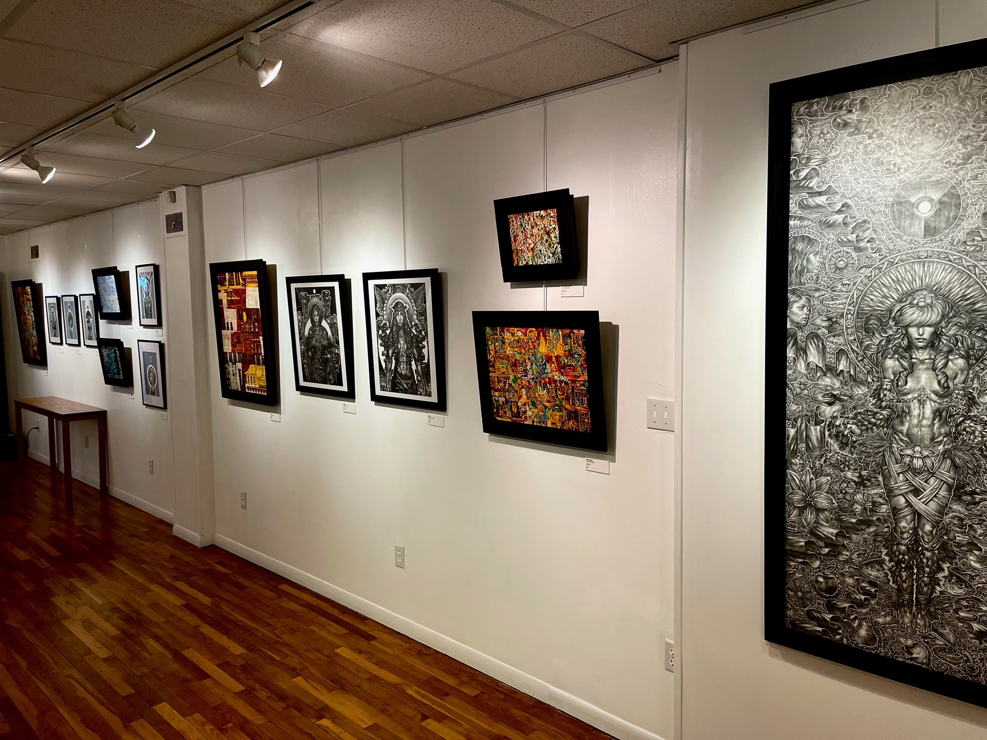
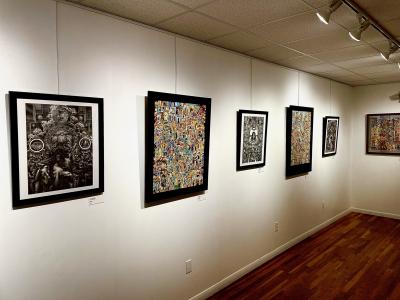
The current exhibit at the Kada Gallery brings together two local artists, Jamie Borowicz and Justin Elliot Poole, for a show that invites the viewer to engage visually with works that find their inspiration in elements of history, mythology, and nature. By definition, a "realm" is a kingdom or empire, so I was interested in how this title relates to the artist's work. I looked for likenesses and differences that might lead me to an understanding of these realms.
Both artists have parallel components in their work but execute their ideas in visually contrasting ways. The most obvious difference is Borowicz's use of color. He creates a wide variety of tones and hues in his paintings that catch your eye immediately when entering the gallery room. In contrast, Poole's graphite pieces are rendered from deep blacks, through waves of gray, to piercing white, absent of any element of the color spectrum. Each artist also covers large areas of the working surface with imagery. Borowicz works from edge to edge to fill the viewer's eye completely. Poole leaves some negative space to shape his drawings into altar-like layouts with his central figure surrounded by portals of the paper's surface.
In Borowicz's artwork, and this has been true in almost everything I have seen from him, I get two distinct feelings. One is being pleasantly lost in his piece. My eyes dart here and there, up and down, looking for a way out. There isn't one. You find yourself being pulled back into the picture plane and falling into the hard-edged canyons of toned hues, or swimming in the swirling organic lines of color. It is hard to get your bearings so one must let go and become immersed in these all-encompassing worlds. It is in letting go that one can see all the subtle nuances that are embedded into his pieces. The wide range of color tones, the complex of pathways and openings – doors that drop your eye past the surface of the painting only to bring it back through another portal in the picture – keep you engaged.
Secondly, I am left feeling a profound sense of time. I think about the time it would take the artist to create the work and how many hours, or days, the artist has spent working and reworking components to get the piece so precisely balanced. For example, the building of layers in watercolor is a lengthy process to begin with, and adding thin sheets of color over others to invent new tones takes time and patience. Also, knowing exactly when a piece has been completed and that it requires no further editing is also part of this time-consuming process. Such realization generally does not come like a bolt of lightning but from reflection, until one realizes that there is no more to do.The meditation the artist has undergone then becomes the viewer's, and we now take up where the creator has left off to continue to ponder all there is to see.
You can follow the lines in these works for hours and still not find the same path again. Is enjoyable claustrophobia a thing? I think Jaime Borowicz would have invented it if it did not exist before. These pieces may be too much for some viewers (minimalists may want to skip the show) but for those who want to be engulfed in an entanglement of color, shape, and line Borowicz's work is a paradise.
Borowicz's paintings work at two distances: from far away they present themselves as colorful abstract tapestries; at close range they are an intricate world one could survey for hours. Seeing them from both vantage points is helpful, so stand back and view the colors and shapes as a whole, then move in and explore the details. This characteristic of working both from a distance and up close is especially true of his cityscapes where he has compressed the whole of a metropolis into a single picture. You will recognize the landmarks that identify where you are, whether it's Pittsburgh, London, or here in Erie.
I had a tough time overlooking the artist's presentation of his work. Each piece is enclosed by wide, heavy, black wood frames that box in the artwork, making the piece feel smaller than it is. The artist's bio states that he has gone on archaeological digs, a fact that recalled the sifting boxes used to separate once-hidden treasure from the sand. Maybe he has wanted to recreate that sense of discovery, of a buried past, with the frame being the box and his pieces being the riches inside? However, I do not feel that this thick perimeter helps the work, but rather, it fights with the delicate lines and compresses the paintings.

Photo contributed by Justus Cotterill.
Justin Elliot Poole is a draftsman of the highest caliber. His ability to coax tones and textures from the graphite is astounding. You just do not see drawings this good that often. Most of his drawings echo the works of Alphonse Mucha, where the composition is built around a central figure with designs and symbolic features flooding the background. Poole, for example, employs the use of halos around the heads of his subjects and architectural structures as frameworks within the pieces.
Additionally, Poole parallels Mucha in that his subject matter is women. Mucha's women are much more relaxed than Poole's, whether they are enjoying their Job-papered cigarette or swirling themselves in smoke and flowers; they have no immediate cares. Poole's girls, by contrast, are tense, alert, and self-confident. They all possess the features of American popular culture's "feminine ideal" with a particular emphasis on abdominals. These women are outfitted with arm bands, headpieces,or bear claws for hands. Their eyes stare at the viewer, daring one to approach.
What surrounds the woman is rendered with equally high skill. Heads of snakes, rats, crows,and fish are interspersed with cloth ribbons, flora and fauna. This construction of elements that build over the negative space and makes up the background of Poole's main subject took me back to the illustration on the back cover of Steppenwolf's Monster album, a drawing that I studied endlessly as a kid. These layers of information fill the surface and create secondary storylines, and much like Borowicz's pieces, provide a place in which to get lost.
Poole's large piece, Dominion, seems to be his magnum opus for this show. It is the largest work and is filled with the most imagery. Along with the animals and flowers, I found references to a German propaganda poster and the artist Yoshitomo Nara. These elements are built out to all corners of the paper, and unlike Poole's other pieces in the show, there is no negative space where your eyes can rest.
This is the second recent exhibit where the female figures I came across are depicted as what our culture touts as "perfect." Kris Risto's Singular Being exhibition at the 10/20 Collective uses women's bodies as his main subjects. Coming across a second set of women depicted in this way gave me pause, and I questioned whether tapping into history or referencing ancient civilizations and fantasy validated the artist's choices? If a male artist wants to draw or paint his fantasy women, who am I to question it? In both Poole's drawings and the work of the aforementioned artist, each has featured his idealized woman. They are beautiful, strong, with long hair, and attitude.
Robert Mapplethorpe photographed the men of his fantasy. He enjoyed alluring subjects and he was applauded for the way he presented these "objects of beauty." Can't an artist choose what he or she wants to use as subject matter? The answer, of course, is yes, but it is up to the artist to own up to their choices. Poole's statement says that he is inspired by "figurative art and the figure's ability to be a symbol and a measure of humanity's progress." I take this to mean that he believes that this figure of refinement is the symbol of progress and one that we should measure ourselves against.
In both shows there were no women of color, even though the symbols and references were from somewhere Caucasians did not exist. This disjunction appears similar to depicting Jesus, who was a Middle Eastern Jew born near Jerusalem, as fair-haired and blue eyed. Poole has his fantasy woman, she is who he turns to for inspiration. But I find confusion in this mix of history and fantasy or history as fantasy. The impressive skill with which the images are rendered is to be admired. I wonder if Justin Poole would rather not be hampered by the political and social questions that his work raises? Would he rather make his work free of any critical analysis? Perhaps he would but his work prompts these legitimate questions, and his statement needs to expand its explanation as to why he chooses the subject matter that he does.
Realms is currently on view at the Kada Gallery in the Colony Plaza until Saturday, Oct. 15 // 2632 W 8th St. // (814) 835-5232


