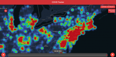
Gannon Student's Live COVID Tracker Shows Nation's Temperature Rising
Web application updated midnight with latest WHO, CDC data
Austin Detzel, a Gannon University freshman, appears to be something of a visual learner. So he took the swell of COVID-19 statistics — just "numbers" to a lot of folks — and plugged them into a map.
Similar to a map of light or heat pollution, his Live COVID Tracker puts case reports provided by the World Health Organization and Centers for Disease Control into an immediate color-coded perspective, from faint blues to intense reds. The United States' major metropolitan areas — especially along the East Coast — seemingly resemble sores or rashes, as these localities contend with widespread outbreaks. Although Erie and its surrounding counties in Northwest Pennsylvania lie in a COVID-19 "cool" zone, it's easy to see a growing threat looming just to the west, a yellow and red "storm" stretching between Cleveland and Pittsburgh, reinforcing the need to restrict travel.
Detzel continues to upgrade the features and tracking capabilities of his map, with the ability for users to toggle U.S. cases, mortalities, infection rates, and clickable county data "bubbles" on and off. Implementation of recovery and artificial intelligence prediction data layers is in progress. Data is archived back to Sunday, Mar. 29 — enabling time lapse shows just how rapidly the pandemic has proliferated in such a short period.
Said Detzel in an interview with WJET/WFXP/YourErie.com: "I hope [people] can see just how fast it's spreading and what social distancing can do to help prevent it. A new thing I just added to it is ... a graph ... that will show just how fast it's rising and how many more cases there are from where there wasn't social distancing to where it is today."
Gannon and other local universities suspended classes nearly a month ago, but Detzel and other area students remain anything but idle.
Matt Swanseger can be reached at mswanseger@eriereader.com


.png)
