Art Review: Rachael Burke
Interior Landscapes at Kada Gallery
What exactly is an interior landscape? I wondered this as I entered the Kada Gallery and read the current show's title. My first thought was of indoor gardens, such as the Botanical Garden Center in Cleveland or the Phipps Conservatory in Pittsburgh. Generally when I think of landscapes, I think of traditional landscape paintings depicting the outdoors, the exterior, and the natural world, which is the opposite of an interior world or space. But as I moved among Rachael Burke's new exhibit of paintings, the title's meaning began to take shape; these apparently outdoor landscapes carry the imprint of the artist's deep interior reality of feeling and impulse, at times aggressive and dark. As Burke notes in her artist statement, the "true subject of my work is the painting process, how I build a painting when searching for equivalencies for what I think and feel."
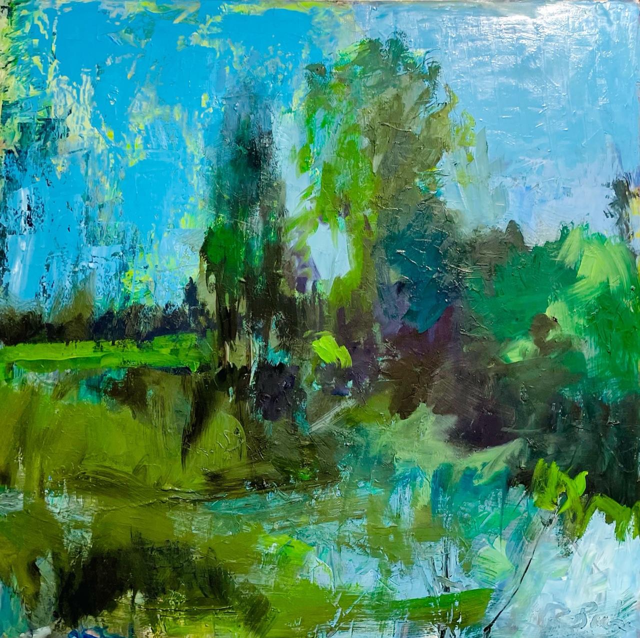
Burke's paintings explore landscapes dense with foliage, awash in color, and rendered with an aggression of brushstrokes. Presented as both oil on canvas and oil on wood panel, the paintings depict natural habitats of trees, bushes, plant life, with the occasional view of a stream or pond. Burke's style is to abstract this setting so the viewer feels the movement and vibrations of the subjects. The trees bend, the leaves and branches blur to become disorientating, and one can feel the disquieting presence of a thick forest reaching out at you. The unfocused colors and shapes had me imagining "coming to" in a strange place and trying to get my bearings.
There is an element of danger to these paintings that give them an edge I appreciate. The paint is applied with a hostility one does not normally associate with landscape paintings. Some of the slashes evoke a machete chopping through a dense jungle of leaves. It seems like the artist uses brushes, palette knives, and perhaps even fingers, to apply the thick swashes of oil. Some of the works, like Hidden, glistened with varnish, giving the vegetation a wet look as if the image were rendered after a rainstorm.
 Side By Side by Rachael Burke
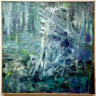
Two works that particularly intrigued me were Essential Architecture and Marking the Way. These were the only paintings in the show that appeared to have the same subject matter: a pile of branches and sticks as the focus with each rendered in a different way. The latter had the pile represented in more detail; there was depth to the stack with deeper inward holes of dark and the branches had more definition. In contrast, Essential Architecture veered farther into abstraction, the brush strokes more violent and blurred. The white used on the sticks gave them a ghostly pallor and the sticks transformed into bones and cracked ribs on the canvas. This sequence with the distortion of the subject had me wondering how far the artist could go into abstraction. Would she at some point abandon all recognizable forms?
Another painting that I kept returning to was Side by Side, an image of two trees on a far bank situated in the middle of the panel. Knowing (not well but by sight) both Rachael and her partner Dan Burke – another local painter – I couldn't help but see this work as a double portrait. The tree on the left resembled a figure with Rachael's long straight hair falling on her shoulders, while the tree on the right called to mind Dan's more unkempt hair and taller silhouette. Pure coincidence, perhaps, but the artist entering her own imaginative landscape as a tree seems a fitting and maybe even sly idea, reminding us that inner and outer worlds overlap, at least in Burke's work.
The artist's exhibition statement does not clarify if she paints plein air (ie. out in the open landscape) or works from photographs, but I felt this information is not important, and perhaps is intentionally kept from the viewer in order to free us from a tangible starting point. Burke states that she is "an improvisational painter," and she makes most of her decisions "in real time instead of using a completely or even vastly predetermined system." The artist's emphasis on improvisation freed me from any imposed agenda while viewing the work; I felt I could improvise which paintings to explore at random.
My one reservation is the number of paintings that were shown in the space. The works were so closely hung that they did not have a chance to breathe. One wall had paintings on top of each other, with the smallest piece in the show hung up high where it was difficult to see. Unfortunately, such crowding often characterizes local galleries, as opposed to larger spaces like museums, because the need to generate income means displaying more work, which in turn means more chances for sales. I have encountered this problem at almost every gallery in Erie, and the overpacked walls have always taken away from the work. I understand the "Salon Style Gallery" was fashionable in the 19th century, but now having space for your eyes to rest and recharge between works seems more essential than ever, given our eyes' constant bombardment by images from television and computer screens.
I enjoyed this show for its exciting brushwork and the underlying feeling of menace that inhabited many of the works. The duality of calm and aggression that exists within nature; what appears to be serene can be a mirage for the danger that lies within. What may at first appear to be an innocuous landscape painting turns into something far more ambiguous with deeper exploration.
Interior Landscapes runs until Jan 27, 2023 at The Kada Gallery // 2632 W. 8th St. // Visit kadagallery.com


